Thirty High
Brand Guidelines
This brand toolkit provides the flexible framework and assets to create a brand experience that is always and unmistakably Thirty High.
For further support contact:
Miranda Bateman
Miranda.Bateman@landsec.com
Brand Strategy
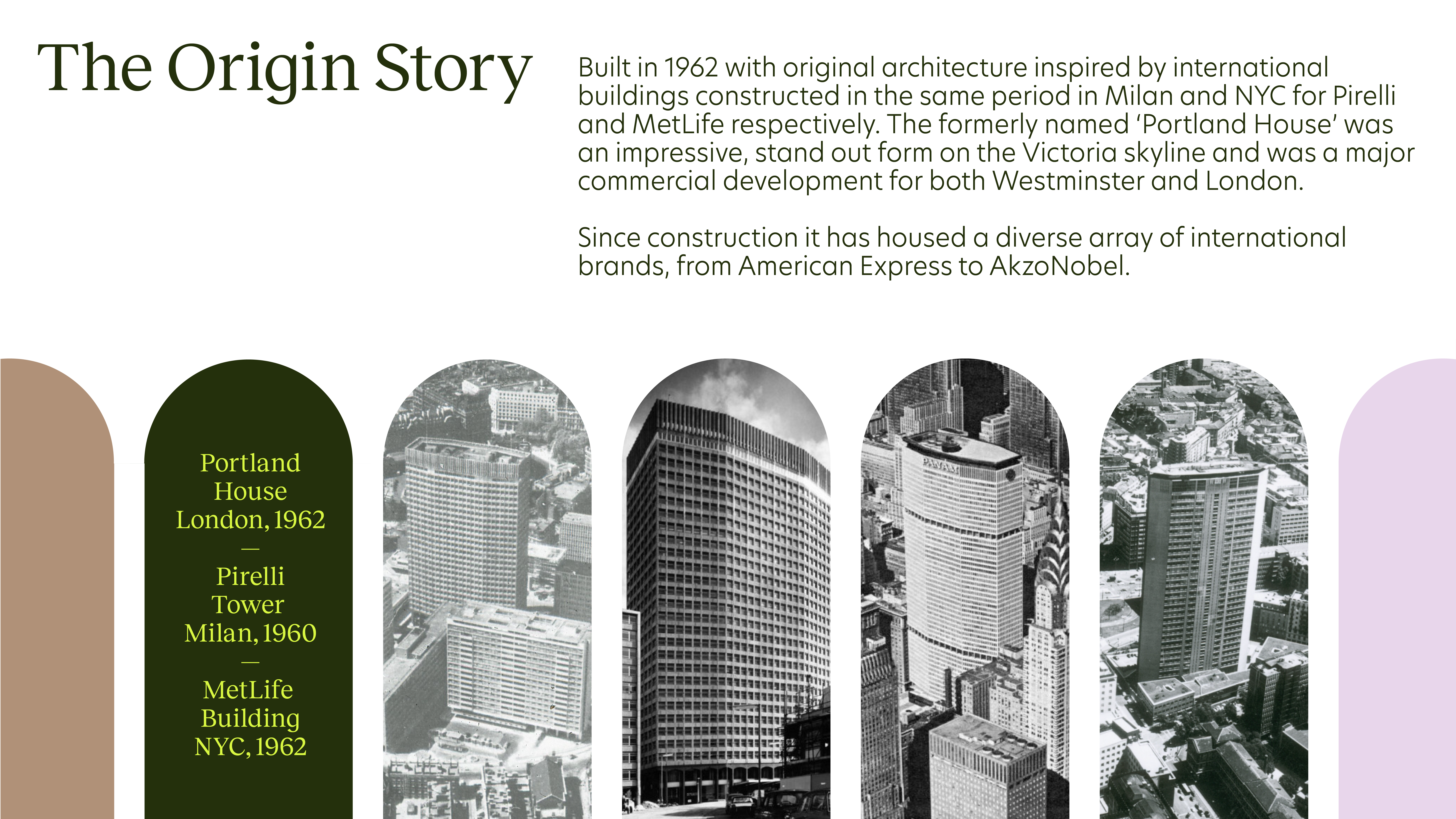
We are here to disrupt the market with a unique mix of prime product offer, customer focus and location. Our brand strategy consists of two simple and connected ideas that build on our authentic origin story: Our Brand Manifesto (How we focus our actions); and our Brand Promise (How we communicate our brand).

Brand Manifesto
Our manifesto is a simple statement that’s bold, deep, and inspires action. It’s a powerful reminder to our stakeholders, customers and all those who interact with our brand; of who we are and what we want to accomplish. By sharing our brand manifesto, we draw focus to our beliefs and inspire action.

Brand Promise
This is how we articulate our brand value proposition, setting our customers’ expectations of our brand. We use our brand promise to help us tell stories about what we do and why we do it. This promise communicates to our audiences that Thirty High brings innovation and status to the modern workplace, ahead of category norms. It also allows us to draw attention to our presence on the SW1 skyline and the benefits that provides.

Logo
The Thirty High logo is our most important core brand identity element. Always ensure consistent placement, sizing, clearspace and color usage. This section will also cover our co-branding principles, SoMe logo and app icon.
Hover: with/without guides

Logo Variations
There are two applicable logo versions, primary and secondary. The stacked logo is always used in the first instance. There may be needs or opportunities where a single line logo is more impactful/necessary in which case refer to the in-line version below.

Logo Clearspace
When placing the logo, it's important that it's given enough space from the margins and other elements. The clearspace principle derives from the size of our Y. The same clearspace rules exist for the in-line logo.
Hover: with/without guides


Logo Sizing
Our logo is designed to work at all sizes. The minimum logo size is set to a width of 100px/2.5cm, ensuring proper legibility. There is no set maximum size. If you go big, always remember to follow the clearspace rules.

Logo Placement
Our logo placement system is simple and clear, but has enough flexibility to accomodate various applications. The primary placements are centred (for instance an end frame of an animation) and the corners (for instance a website homepage or a brochure footer). When positioning the logo, strictly use one of the alignments below.
Primary Logo Placement
Centered

Corners

SoMe & App Logo
Our social media avatar is designed to stand out on any social media platform. Since it's almost always connected to our username, it features our iconic arches, creating a strong and recognisable brand mark. Round and Square formats shown.

Colour
Our brand consists of two palettes that when used correctly creates a harmonious balance. Only use the colourways shown below.
A celebration of the original and the new, our palette is an elegant contradiction. Rich and warm green tones reminiscent of the light-reflecting nature of the new entry pavilion; and a restrained and architectural series inspired by the heritage of the original construction come together to make a thoroughly modern, utterly unique colour series.
*CMYK colours to be specified post colour testing.
Always conduct a print test before comissioning printed material.


Colour — Logo
Our colours have been designed to create impactful pairings with contrast and variation when applied to our logo. Always seek to create contrast using the below as inspiration. Avoid overly similar tones.

Typography
Arresting and confident, our typography carries our message across all channels and touchpoints.
We use two brand typefaces. For headlines we use Reckless for all other copy we use New Hero. For emails and internal communications our system font for Mac and PC is Arial.
Font — Reckless

Font — New Hero

Licensing
Reckless — Available from Displaay.
New Hero — Available from Adobe Fonts as part of an Adobe Creative Cloud subscription, cleared for personal and commercial use. Visit Newlyn to purchase additional licensing and services.
Tone of Voice
When we speak, we do it with contrasts. We are clear and exact about our subject matter which means we use facts and evidence, whilst allowing equal room for us to help encourage, invent and inspire.

Principles

Key Message Framework
Our base messaging framework supports a communications toolkit that enables us to deliver strategic communications over the pre-let to post-launch lifecycle of Thirty High. Each stage is guided by unique objectives with specific feature, benefit and proof-points along with content pillars that identify key focus areas for communications development. These details are placeholders until design and amenities are confirmed.

Key Message Example — Pre-launch
Build awareness to wide audience & stimulate pre-registration of interest.
A new high for
the workplace
at SW1
Key Message Example — Launch
Demonstrate relevant proof-points to inspire interest/conversion.
The new high
for your
workplace
Key Message Example — Post-Launch
Show experience, life and community at Thirty High.
Viewpoints at Thirty High
Layout
Layout is an important part of our design system. Our layout principles are flexible and should always put our content in focus.
Margins, Columns & Grid
Image 1 —
To define the margins for any layout, we divide the shortest edge by 18.
Image 2 —
We apply columns in multiples of 3, e.g. 3, 6 (shown), 9, 12.
Image 3 —
We use the margin dimension to run a uniform baseline grid from the top, this approach provides consistency across a broad range of formats from web banners to hoardings.

Logo & Type Sizing
We use the baseline grid to define our logo and type sizes.
Image 1 —
The first image below illustrates that the logo height occupies whole multiples of the baseline grid. It can be as large as required as long as you adhere to the logo clearspace rules and margins.
Image 2 and 3 —
Headlines and body copy cap heights are also measured using the baseline grid.
See Type Sizing in Detail for further explanation.
Image 3 —
Limit type sizes and weights to a maximum of three diffrent styles to ensure there is a consistency across all communications. Use scale to create impact and to make an impression.

Type Sizing in Detail
We use the baseline grid when sizing copy across communications. Where one baseline is X, the headline and body copy examples shown below use this as a measure. We use powerful headlines and short messages to communicate with clarity and conviction.


Pavilion Graphic
We use the entry pavilion as a graphical element in communications to frame messaging and photography, representing a window in or a view out of Thirty High.

Construction
To create a repeat pavilion graphic we start by firstly drawing a circle. Where the diameter is shown as X, the height of the arch is 2X. This can be adjusted when necessary to lower or raise its height dependent on application.

Use
Once we have established the pavilion graphic, we determine the stroke thickness by taking the diameter (X) and dividing it by 8. We then populate the space within the arches with content. Use the Layout principles when working with type and imagery within the arches as you would with any other layout/communication.
Hover: without/with content


Photography
Imagery is key to bringing authentic stories to life. Through it we capture the building, the amenities, the place and the people (including the tenants when launched).

Photography Library
All photography shown here is for visual purposes only to illustrate design intent. Distribution, reuse or resale is strictly prohibited. The photography library will be updated with commissioned photography once undertaken which will feature bespoke art direction, propping and context.
The Building
When choosing angles to capture our building, we celebrate its biggest USP: height. We can look upwards, or take surprising external viewpoints where we capture both building and vista. In addition, we show the cityscape from the internal floorplates to showcase the truly unique vantage points from the tallest tower in SW1. Buildings shown here are reference only to inspire art direction for future shoots of Thirty High.

The Amenities
When the opportunity arises, we show inside and outside at the same time. The amenity spaces with the views. Maximise light and sense of space. Capture the key amenities filled with life and energy to highlight this is a place being developed with people at its core.

The Place
Our local area shots should celebrate the human impact and benefits of the location. No shop-fronts or close-up pub signs, we look internally to capture the people within the places, those that use it and those that make it unique. Our building is iconic and visible from far and wide, when we capture the wider location we look for opportunities to see our site in context.

The People
From our internal team, to the architects and eventually our tenants, we feature the people that defines the place. We shoot portraits with a sense of confidence and stature, incorporating a slight upwards angle and a celebration of individuality that prizes them as highly as the building itself.

Applications
Continuously updated with relevant examples. Use these examples as inspiration when creating brand materials.
Indicative Hoarding

Social story

LinkedIn Post

Agent E-Mailer

Holding Page

Brand & Design by Studio Phoenix.